Straightening Out Final Fantasy X's Sphere Grid
The idea for this post began about two months ago, when I made a comment on reddit that turned out to be a little controversial — I said that I didn't like Final Fantasy X's leveling system. After this, I kept wondering how it would look if you separated the underlying system from the convoluted interface, and it also seemed like a good opportunity to finally learn how to generate diagrams using GraphViz.
From there, reaching this point has been a fairly long process. It involved learning GraphViz, a lot of data entry, generating some initial diagrams, desperately searching mailing lists for ways to, er, "encourage" GraphViz to actually do what I thought I had told it to do, and so on. But after spending a ridiculous amount of time experimenting and tweaking, I finally managed to generate some diagrams that looked… absolutely hideous. You see, as a programmer, I am by my very nature completely incapable of creating a visually-attractive diagram or interface. Luckily, I was able to recruit my good friend Matt Wilson to tell me what to do, and the resulting polish of this diagram is entirely due to his guidance.
Every GameInternals article starts with a fairly detailed description of both the game and the mechanic that are that article's subject, so that readers unfamiliar with the source material won't be completely lost. If you're already familiar with Final Fantasy X and its sphere grid system, please feel free to skip down to the section where things will get interesting. If this is new to you, or you just want a refresher, carry on.
About the Game

Final Fantasy X is the tenth game in Square-Enix's long-running Final Fantasy series of console RPGs, and was released in 2001 as the first entry on the Playstation 2. The game introduced a number of innovations and changes to the franchise, many of which proved to be rather controversial among fans.
The traditional free-roaming overworld map was removed, requiring all areas to be traversed linearly for most of the game, with a menu-based "jump to location" system becoming available just before the end of the storyline. Areas were truly 3D, replacing the "3D character superimposed over a pre-rendered 2D background" approach that the three Playstation entries utilized. Voice-acting was introduced, and for the first time since the start of the series, the entire soundtrack was not composed by Nobuo Uematsu, with Junya Nakano and Masashi Hamauzu contributing almost half of the songs. The Active Time Battle combat system that had been used for the last 10 years and 6 games was replaced with a new turn-based system with turn order and frequency being determined by a character or monster's speed. "Sideline" characters could also be swapped into the active party mid-battle for the first time.
Plot-wise, the game follows Tidus, an ace blitzball (a fictional underwater sport with similarities to soccer and water polo) player who finds himself thrust 1000 years into the future. He joins up with a summoner named Yuna and her guardians, and the game follows the group on her pilgrimage across the world of Spira. The journey involves visiting a number of temples to increase Yuna's summoning repetoire, with the final objective being an attempt to defeat Sin, a massive creature that periodically attacks and destroys cities, but can be forced into dormancy for a 10 year period if defeated.
Despite the numerous sweeping changes to the traditional Final Fantasy formula, FFX was still extremely well-received, and its popularity resulted in becoming the first game in the series to receive a true sequel (Final Fantasy X-2) involving the same setting and characters. Many fans consider FFX to be one of the best in the series' lifetime, for reasons including its cast of characters, the large amount of side objectives, and even its unique character-leveling system.
The Sphere Grid

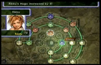
Final Fantasy X's leveling system is known as "the sphere grid", and involves moving cursors representing the characters through a board of interconnected nodes, most of which boost the character's statistics or grant a new ability or spell when they are activated. The characters each begin in different sections of the board, but can eventually move into each other's sections and activate the nodes there as well. This allows for a fair amount of customization through selecting the path to traverse the board, but has the somewhat strange (although not particularly uncommon in RPGs) side-effect of the characters becoming less unique as they progress, as a result of increasing crossover in their spells and abilities.
If you'd like to watch the in-game tutorial about the sphere grid, here is a YouTube video showing it. I'd highly recommend watching it if this is new to you, since seeing it in action will probably make things more clear than my description alone.
By participating in battles, characters are awarded Ability Points (AP), similar to experience points in most RPGs. When the character has accumulated enough AP (a threshold that increases as they progress), they receive a Sphere Level, which is used to move about the sphere grid. A single Sphere Level can be used to move that character's cursor either one node "forward" in the grid, or up to four nodes "backward", where forward refers to a node they have not yet visited, and backward involves backtracking over previously-visited nodes, which is sometimes necessary to return to alternate branches.
Simply moving through the grid does not convey any character growth in and of itself, nodes must be manually activated for the character to receive their bonus. The node at the character's location as well as any of the nodes directly connected to it can be activated by using Spheres, which are extremely common drops from monsters. There are several different types of Spheres, each of which is able to activate different node types. For example, a Power Sphere activates nodes that increase Strength, HP, or Defense, and an Ability Sphere can activate nodes that grant abilities or spells.
Other than blank nodes, ones that increase various statistics, and ones that grant abilities/spells, the sphere grid contains one other node type: locks. There are four different levels of lock nodes, which are not valid to move onto or past. They are used as barriers, blocking access to particular areas of the grid, and separating each character's section of the grid from the others'. When a lock node is activated by using a Key Sphere of the matching level, it becomes a blank node, and the path it was blocking is opened. Since activation removes it from the grid, only one character must activate a particular lock node to open that connection for all characters' use in the future.
There are also a number of other rare Sphere items that have more advanced effects on the sphere grid, including ones that let a character teleport to a different location on the grid (generally to another character's location, or a location previously visited), ones that allow activating a node without being near it (again, usually a node another character has already activated), ones that replace a blank node with a stat-boosting node, and even ones that allow turning a stat-boosting node into a blank (to be replaced with a different or stronger stat node via the previous type).
Sphere Grid Layout
Now that the mechanics of the sphere grid have been explained, let's take a look at its overall layout. Note that three different sphere grid layouts exist among the different versions of the game. This article discusses the original version from the Japanese and North American releases, though the "Standard" grid in the PAL/International version is quite similar. The "Expert" grid in the PAL/International version is completely different, however.
(Click to view full-size, so you can see details such as the various characters' starting locations).

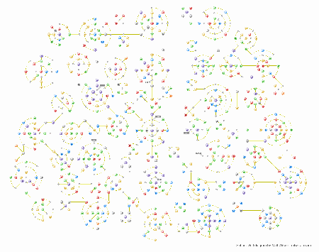
Pretty complex, right? 828 nodes in total, paths going every which way, the whole thing just seems to scream of choice and non-linearity. But now, let's see what it looks like if you render the whole thing in straight lines. While looking at this, keep in mind that Key Spheres aren't given at all until you're a decent amount into the game, and removing level 3 and 4 locks isn't readily possible until almost the very end. So any early branches beginning with locks are often not an option at all, the first time they are reached.
Again, click to view full-size. Ridiculously-large image warning — 14,107 x 4,332 / 701kb. I recommend that you save this image to your local machine, where you can use an external program that's more flexible about zooming and panning than a browser.

As it turns out, normal traversal of the grid is actually extremely linear. Multiple characters have stretches of over 50 nodes without any branches at all. Yuna's section does not really even include a single practical choice during her initial pass through it. Most of the interesting decisions on the sphere grid will be made with the special Spheres that allow you to warp to a different location, but those are quite rare, and a player will likely only acquire 2 or 3 of them in the entire main game.
The Power of Presentation
I think the really interesting implication here is just how much influence the interface to an underlying system can have on a player's perception of it. When I first finished all my data-entry and started generating diagrams, I was shocked at how linear they were coming out. I thought that I must have made a mistake somewhere, because there couldn't possibly be so few branches. Perhaps the linearity of it is more obvious to people that really invested a lot of time maxing out the grid for all their characters, but from my own experience with the game (finishing the storyline, decent number of sidequests, each character covering perhaps ¼ of the sphere grid), I certainly didn't expect it to look this way.
There are a few aspects of FFX's interface to the sphere grid that give the impression that it is more complex than it actually is. First of all, obviously the visual layout of it is a huge factor. The nodes are laid out in a manner that makes it quite difficult to determine the implications of following any particular path, without painstakingly tracing down it node-by-node. Similarly, determining a path between any two particular nodes is extremely difficult, and usually just involves trial and error.
Because it is a character-improvement system, you are encouraged to use it whenever your characters gain any sphere levels, so you typically only make a few moves at a time. If you choose to save up many sphere levels before using them, you are forcing your characters to be weaker than they technically should be, so most players will not do this. Since moves are not being made in one long stretch, it is much less obvious how long it has been since you have had to make a choice, and the path certainly doesn't "feel" straight due to the node layout.
Managing multiple characters in completely different areas of the grid also helps to mask the linearity. Flipping between the characters and remembering where each is going can make it feel as though you're making decisions, even if all of them actually end up simply proceeding a few steps forward down their respective, completely linear, paths. This also tends to make it difficult to recall when you last had to make a choice for a particular character, as opposed to a choice on any character, so several characters may follow a straight line for a very long time without it being obvious to the player.
Wrapping Up
Hopefully it's been at least somewhat interesting to see how much of a difference there can be if you take a game's system and change the representation of it, so that you're not viewing it through the lens of the interface that the developer put on top of it. The diagram may also be useful to anyone playing through the game in the future, since it makes it much, much simpler to determine the implications of choosing a particular path.
Sources
- DocTabasco and Zeric's Sphere Grid Diagram - Used for data entry, since many other diagrams do not indicate the numerical bonuses from each stat node, only which type of node.